Sports
College Basketball programs are ruining historic brands, exhibit A and B: Davidson and Saint Joseph’s – Mid-Major Madness

Filed under:
We’ve got a new Wildcat and a new Hawk, and both are … not great
This week has produced two more devastating tales in the ever-continuous saga of mid-major programs ruining their own historic bands.
Both Davidson and Saint Joseph’s of the Atlantic 10 unveiled new aspects of their athletic identities. The Wildcats released a new logo on Thursday, followed by the Hawks reveal of an updated mascot costume Friday morning.
Neither has gone over particularly well with fans and alumni so far. Both schools removed much of the originality that gave them such unique identities within college athletics.
So, let’s take a look at both of the updated brands and discuss what initial reactions have been like, and how the new logo and mascot failed to meet the standards set by predecessors.
In a YouTube video released on the school’s channel, Davidson President Doug Hicks discussed the need to create a distinguishing visual identity for its brand.
“The images we use to represent Davidson should consistently reflect that quality, that level of excellence,” he said. “The college’s visual identity, its brand, also should be distinctive. It should be unmistakably Davidson.”
“We play in an athletic conference, the Atlantic 10, where we are among three schools with a red D, just within our conference,” he added. “In the college’s and universities across the country there are at least 40 Wildcats.”
Those are, indeed, factual statements. If Davidson wanted to create something “distinctive” that would separate them from the pack of other Wildcat logos nationally, they failed — dropped the bag if you will.
#NewProfilePic pic.twitter.com/MfivVGVDc5
Not only is this logo bland, Davidson removed the most distinguishable and iconic piece by taking out the red square behind the Wildcat that’s been present in Davidson’s logo since the 1990’s.
I think it would be fair to say prior to this week, Davidson had one of the most unique Wildcat logos in all of college sports. But the school did fans a disservice by presenting this dull, hyper-modern take that won’t help to carry on the historic Davidson brand.
Former Davidson guard Foster Loyer was quick to express his displeasure with the update Thursday.
♂️ ♂️ https://t.co/Aox9usXG4u
While fans of the college reminisced over the incredible logos of Wildcat past.
We should’ve just re-adopted the scraggly, rabid Cat and called it a day. pic.twitter.com/rnTwznCZLP
And lastly, as those around the conference pointed out how simple and bare minimum it could have been to make this logo uniquely Davidson.
Heartbreaking: Bona fans just made a great point https://t.co/0G11v5C65o
As a St. Joe’s graduate, I have an innate attachment to the previous Hawk and thus have been very pessimistic about this new unveiling. Unfortunately, I still think this was a disappointment.
From what I understand, the school was put in a tough spot with the old costume as officials spent a good portion of their time at Hagan Arena picking up feathers that would fall off the old costume.
While other reports have suggested the company St. Joe’s worked with to refurbish the costume on an annual basis can’t get feathers from its manufacturers anymore. The old costume simply seemed to be a hassle.
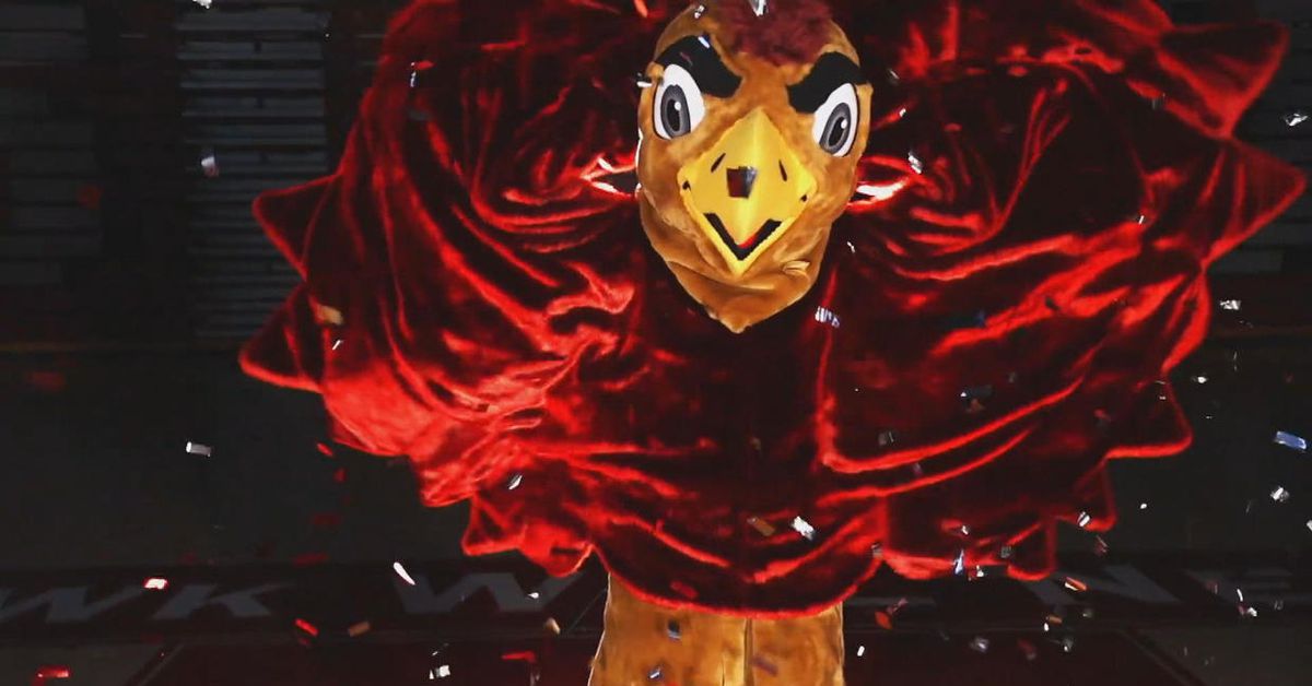
Nonetheless, with a week’s long build up of trailers and a final reveal Friday morning, the updated Hawk mascot was unveiled and perhaps most importantly, it will continue to flap its wings at all games and appearances.
Introducing the newest evolution of The Hawk. After two decades, hundreds of thousands of flaps, and countless games and appearances, the hardest working mascot in college athletics gets a new look. The Hawk Will Never Die! @MascotHall pic.twitter.com/No18jULxXO
The old Hawk mascot was iconic, it had been around since prior to the 2003-04 season while Jameer Nelson graced the court. Ultimately, whatever SJU released, fans of college basketball were going to disapprove.
I don’t get it. You fired your legendary coach who is responsible for most of America knowing who you are. You’ve sucked since. This decaying bird was the last cool thing you had left, mostly because it was so weird. And now it’s gone. Bang-up job. pic.twitter.com/8ThBfTq0nZ
Expectations were low but this new Hawk looks like a cartoon character draped in a Snuggie. Perhaps the most off putting part is the strange bulging eye/eyebrow combo that really stands out.
Why does a Hawk have eyebrows? pic.twitter.com/6oQujrWMnv
St. Joe’s didn’t deviate too far from the previous design, which I think is a big win for fans and won’t totally ruin the national identity that people have come to know in the St. Joe’s Hawk. However, there was room for improvement with this new design and the Hawk becomes yet another example of a mid-major school causing damage to its historic brand with this intention to modernize. Please ban consultant brain from college sports.
GAMBLING PROBLEM? CALL 1-800-GAMBLER (1-800-426-2537) (CO/IL/IN/KS/LA/MD/MI/NJ/OH/PA/TN/VA/WV/WY), (800) 327-5050 or visit gamblinghelplinema.org (MA). Call 877-8-HOPENY/text HOPENY (467369) (NY).
Please Gamble Responsibly. Call 1-800-NEXT STEP (AZ), 1-800-522-4700 (NH), 888-789-7777/visit ccpg.org (CT), 1-800-BETS OFF (IA), or visit OPGR.org (OR) or www.1800gambler.net (WV).
21+ (18+ NH/WY). Physically present in AZ/CO/CT/IL/IN/IA/KS/LA(select parishes)/MA/MD/MI/NH/NJ/NY/OH/OR/PA/TN/VA/WV/WY only. Void in ONT. Eligibility restrictions apply. See terms at draftkings.com/sportsbook. On behalf of Boot Hill Casino & Resort (KS). Licensee partner Golden Nugget Lake Charles (LA).


